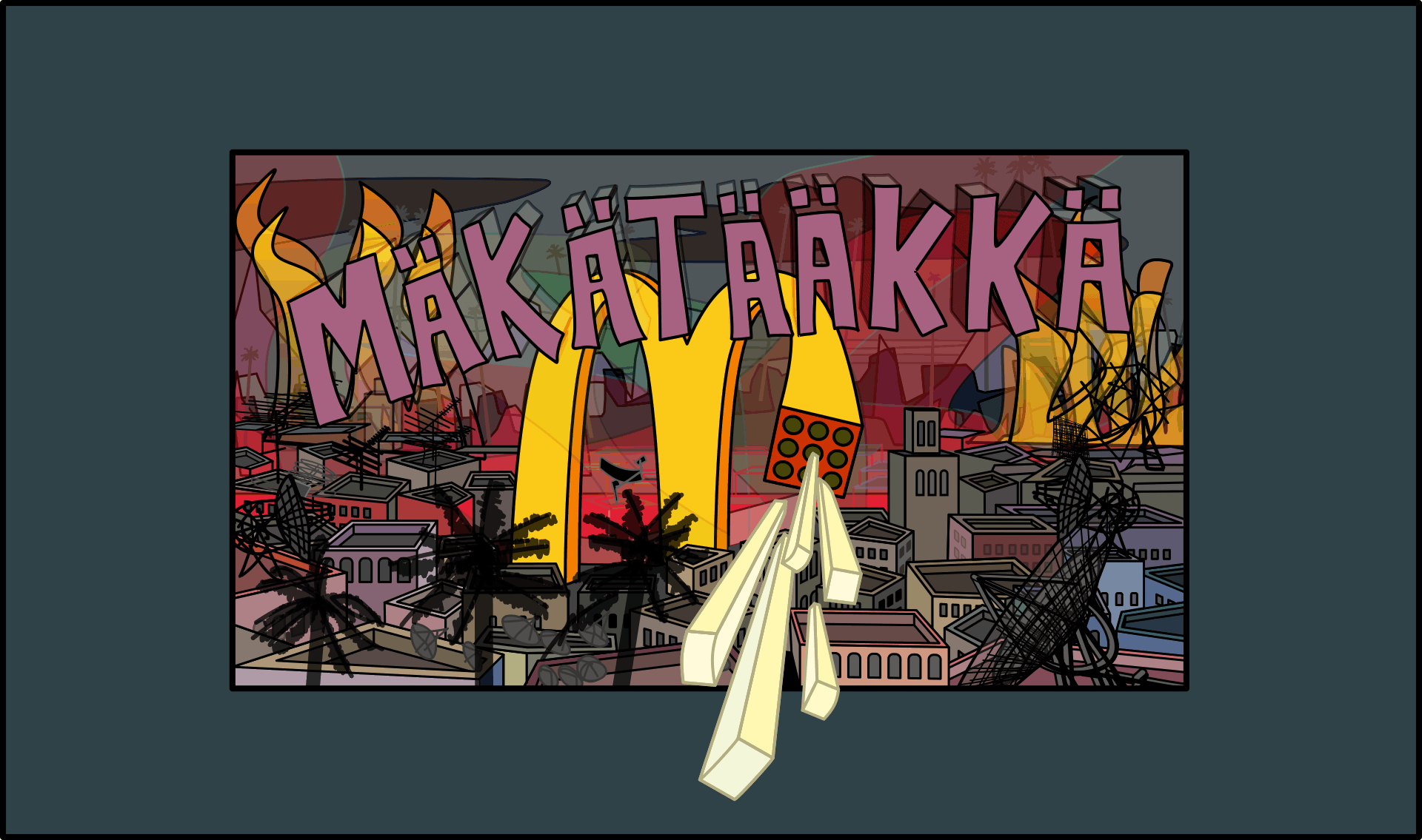
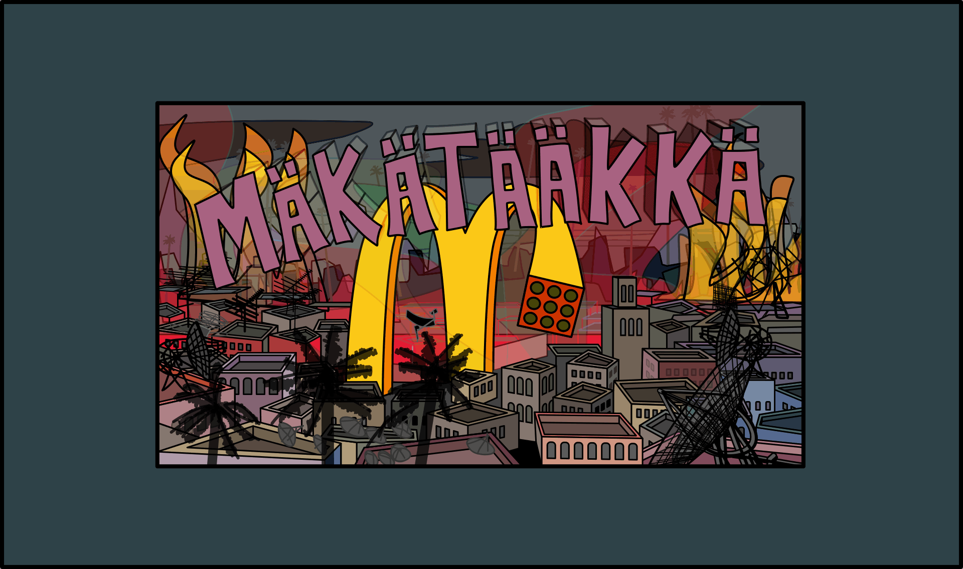
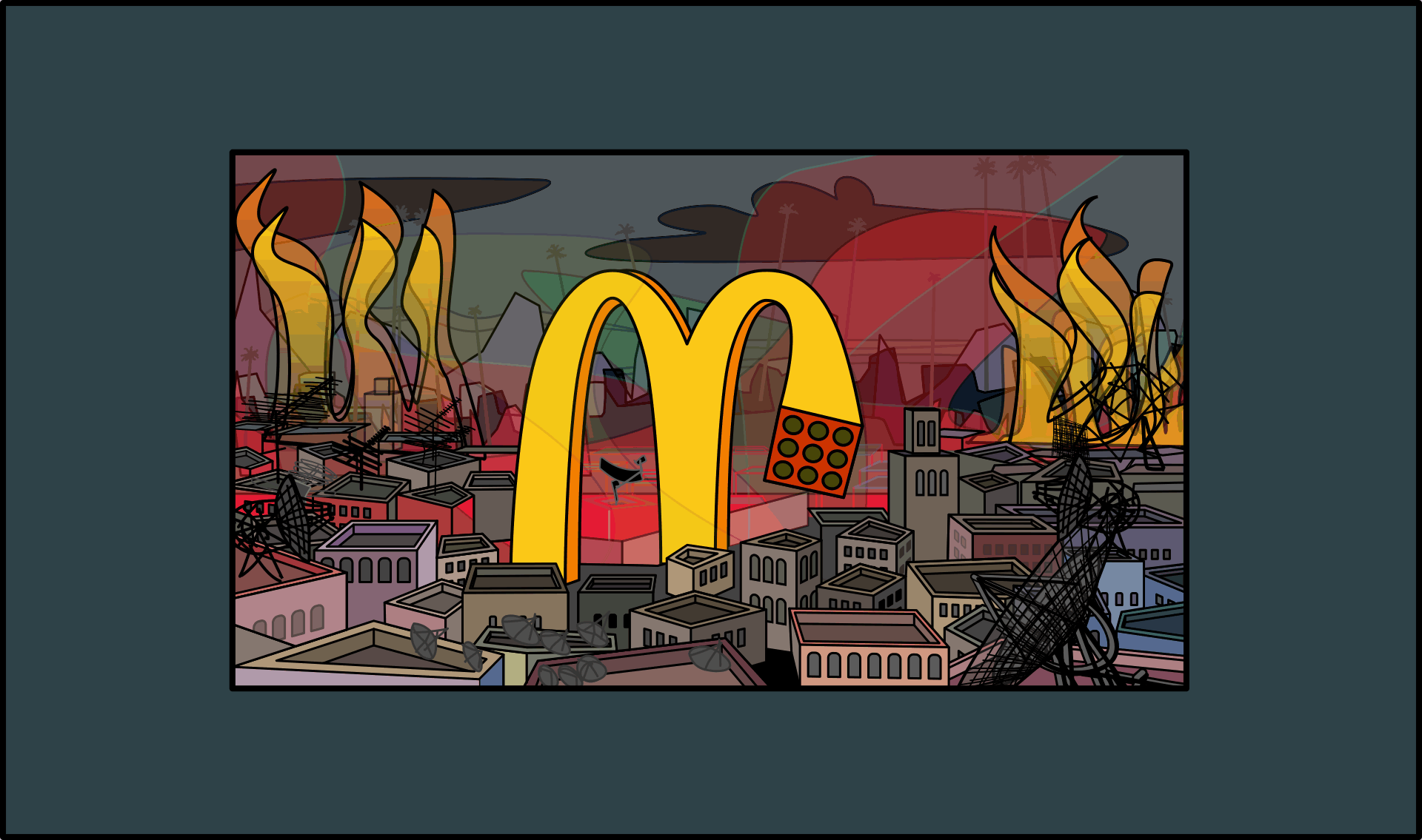
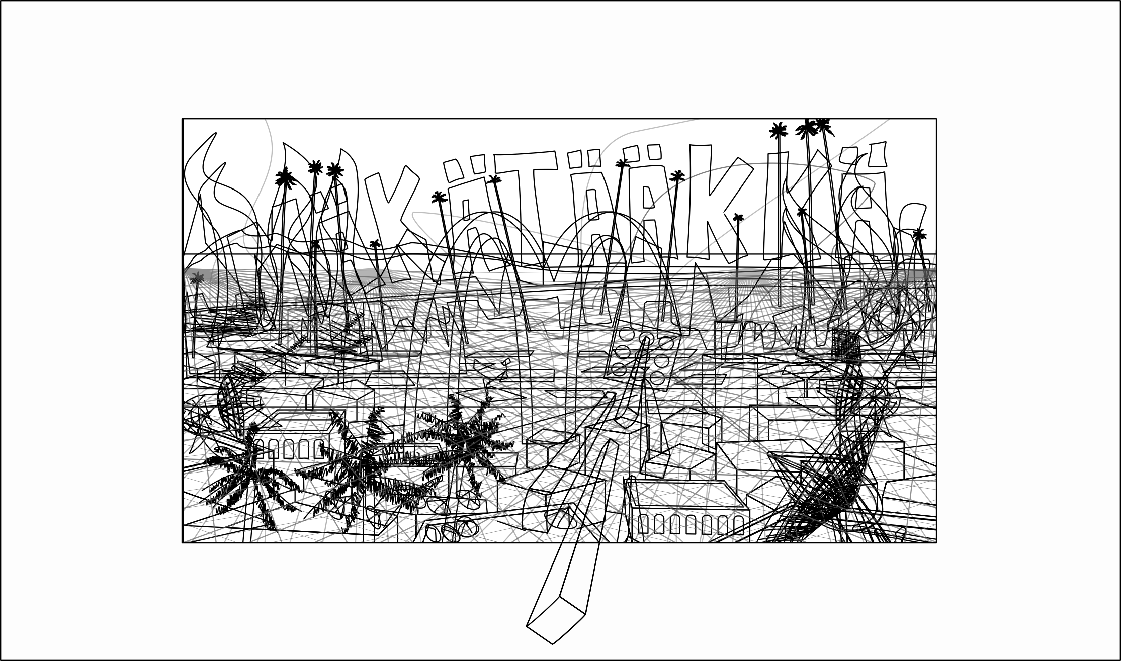
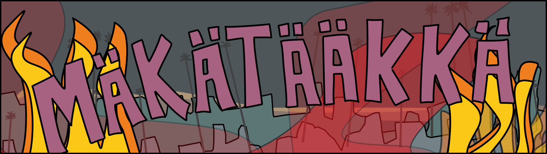
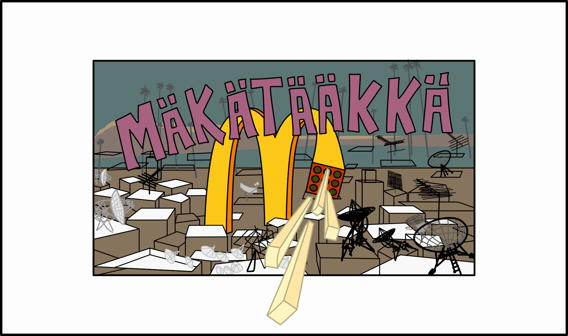
So I have decided to share a few of my personal projects. They are works in progress. This particular one is called “MÄKÄTÄÄKKÄ” is a continuation of the McDonalds series.
I got the inspiration for the name from the Finnish language, which generally has lots of double consonants and double vowels with umlauts.
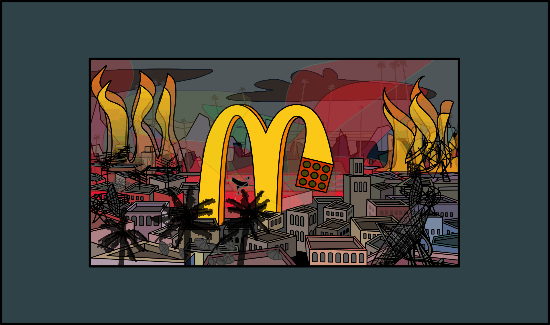
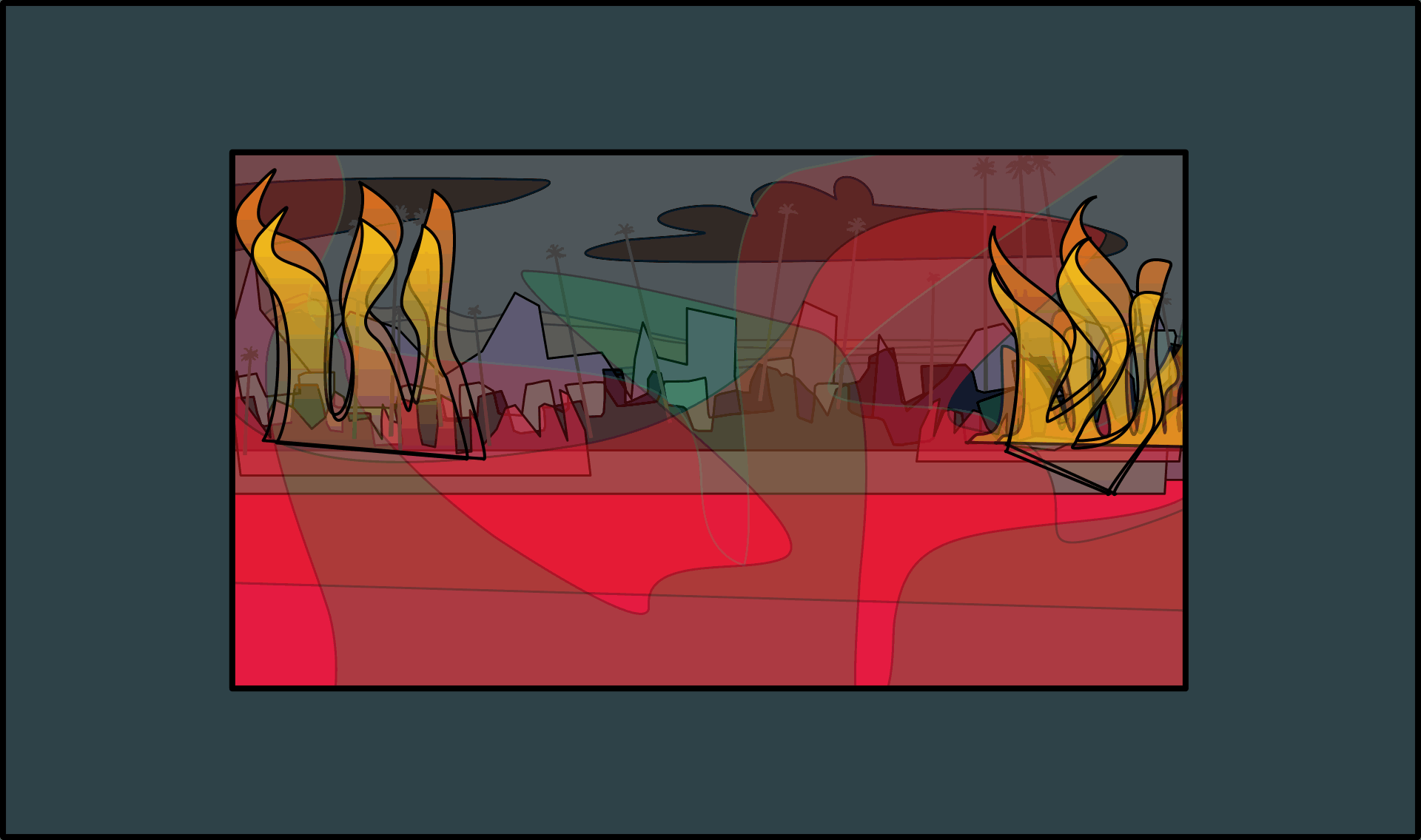
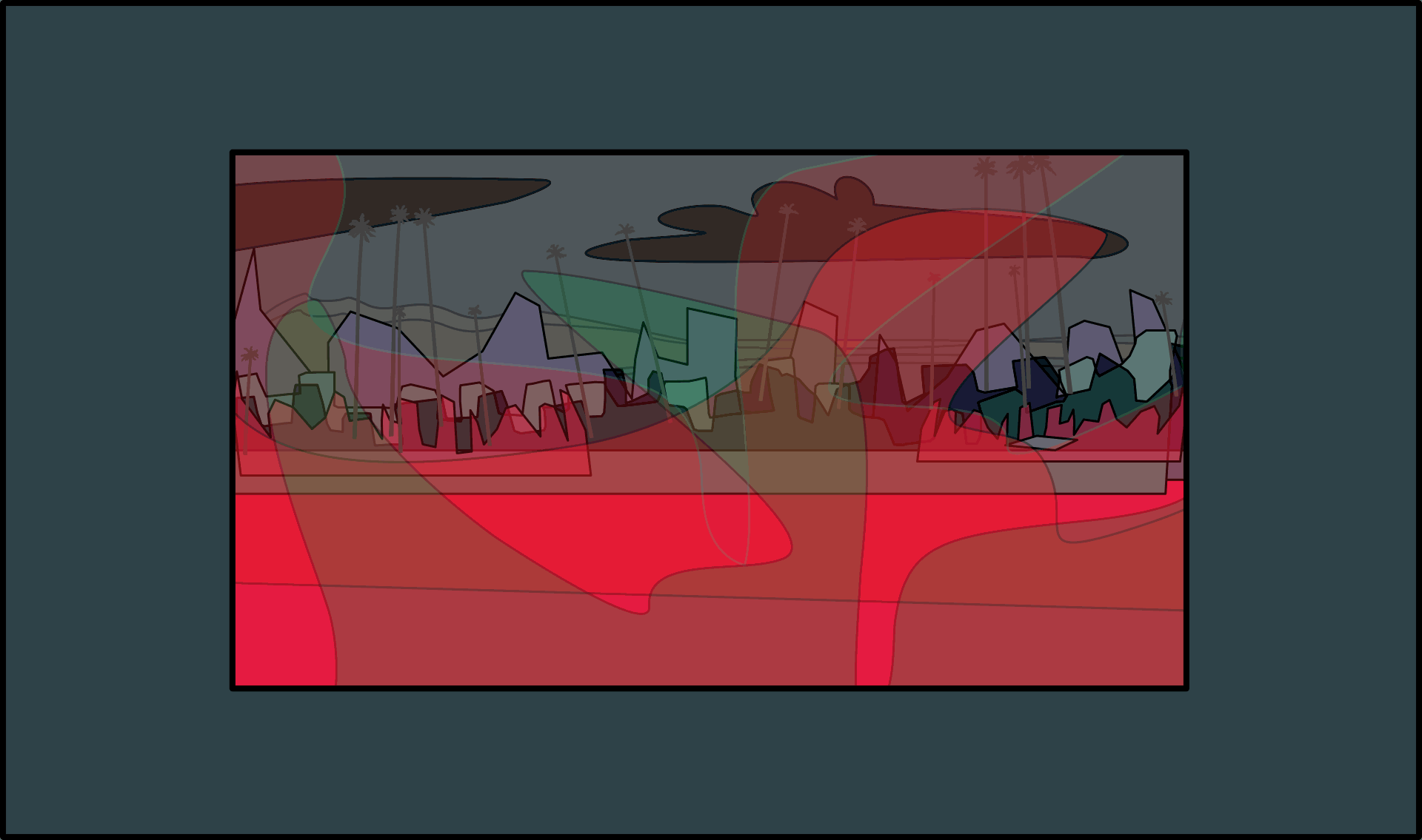
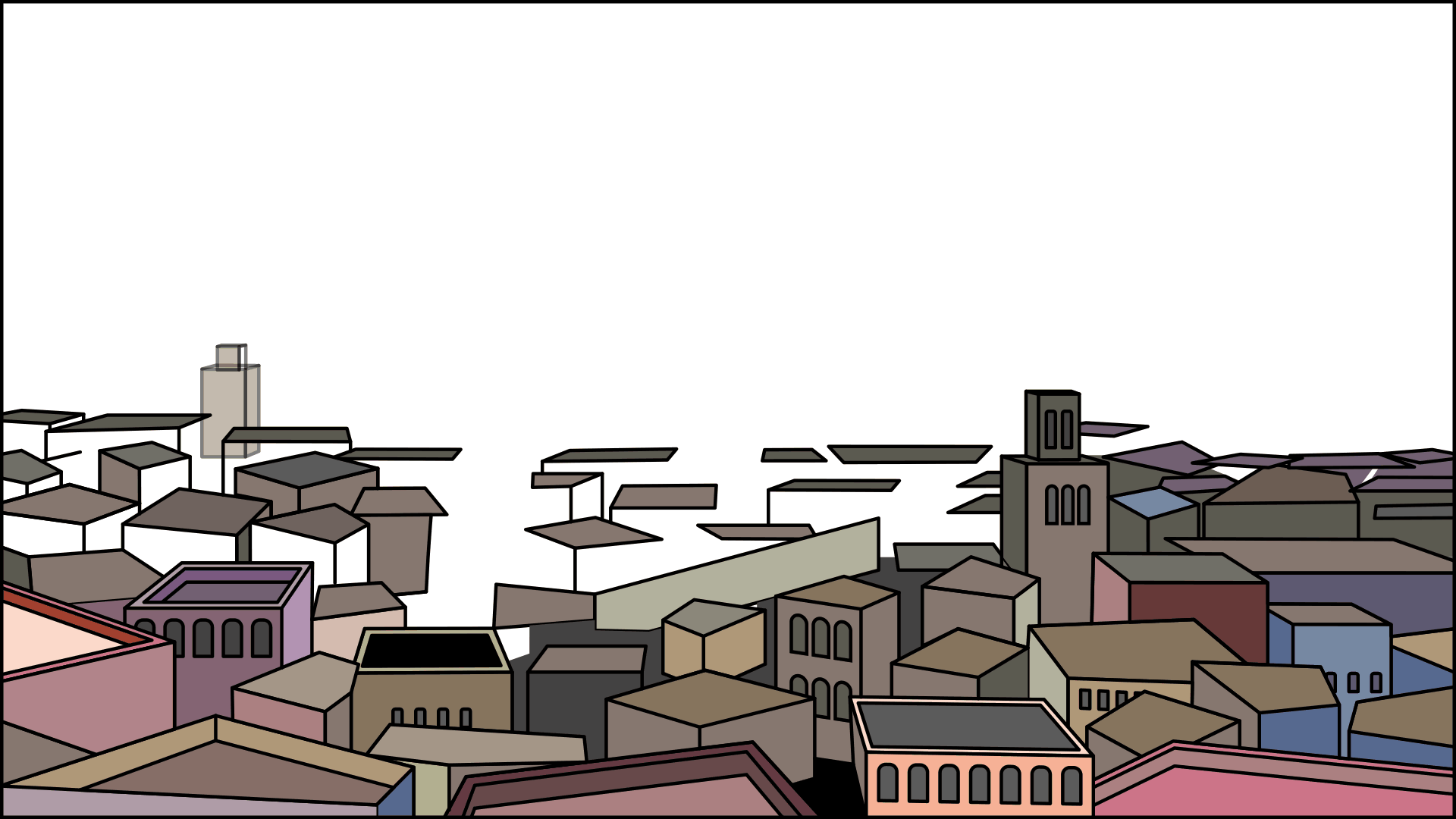
When I was living in the Canary Islands, I was always very tempted to travel to Morocco because it is only a few hundred kilometres away. But I never really got the chance to go because I was either too busy working or never had enough money saved up in the off season. The scenery is inspired by four Morroccan cities: Fez, Rabat, Marakesh and Casablanca. So I have always really wanted to go because it is quite an exotic destination. Hopefully one day I will be able to make the journey from Australia!
The idea behind the drawing is that corporate giants like McDonalds seem to invade foreign regions. The irony (for me) is that although I don’t like huge multinational companies, I have actually eaten at McDonalds about once a week for several months now. Because it makes me get in the mood. So although I encourage young people to always buy local food from privately owned businesses², no, I certainly don’t hate McDonalds.
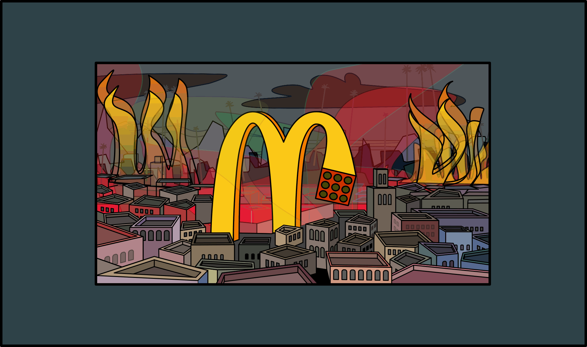
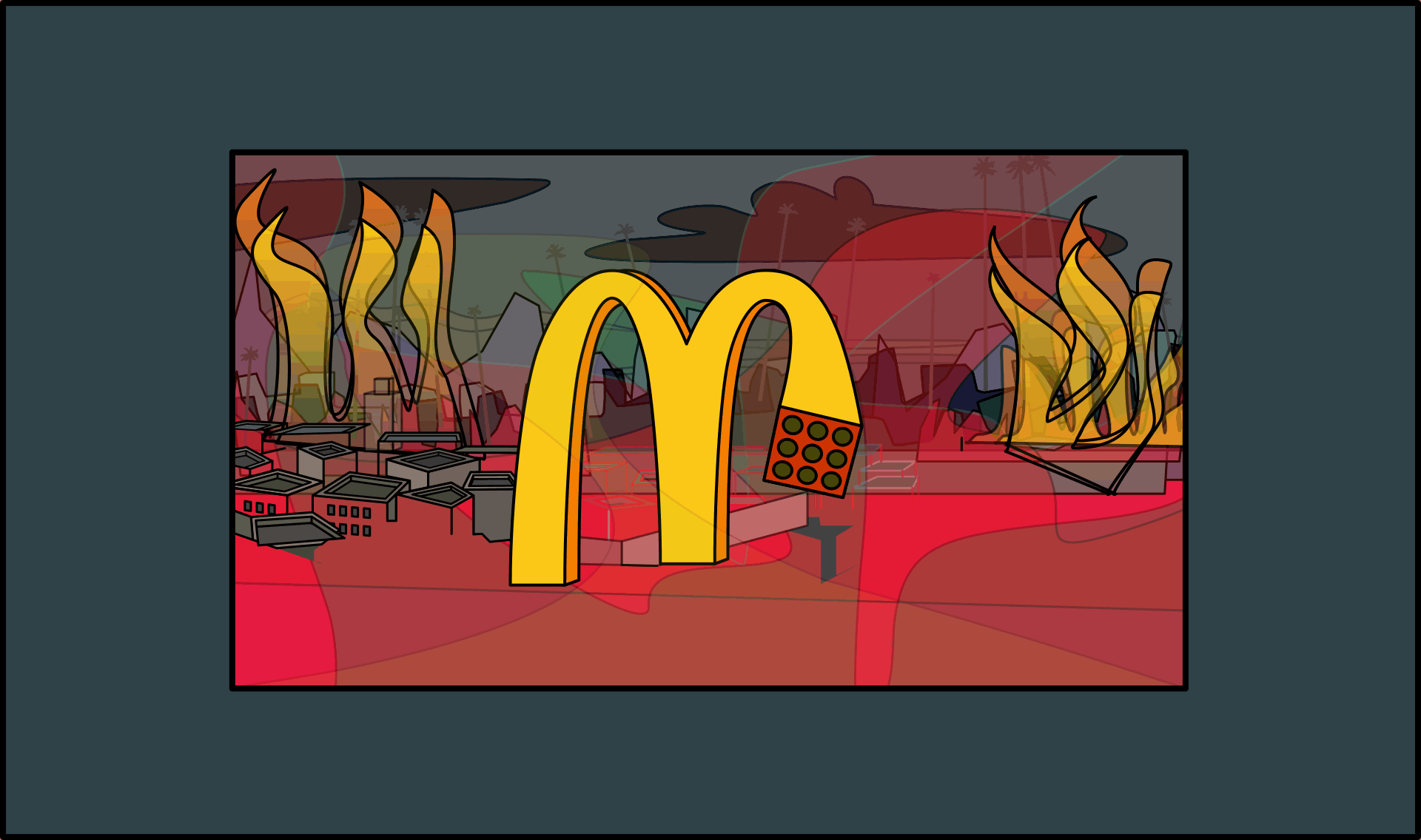
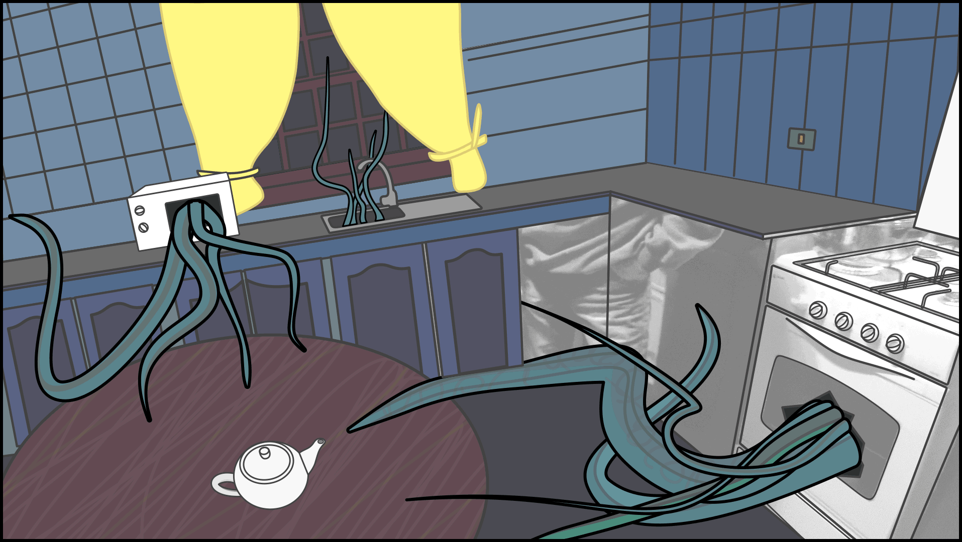
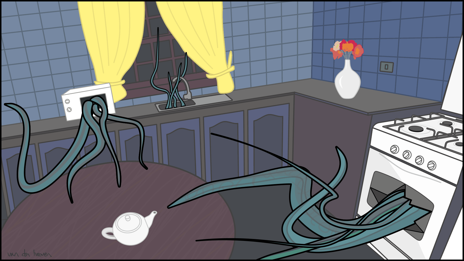
Every time I look at the McDonalds M now, I imagine it turning into a big giant robot and the legs moving and flexing around organically like an octopus. So in this illustration, I imagine it that it has just frees itself off its perch and goes and destroys all the surroundings. And what would it use to destroy everything? Why, chips shaped like bullets or missiles of course!. And they would have to come from the base of its legs…
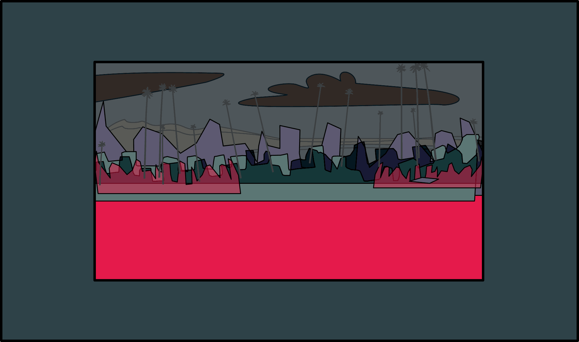
I noticed that there are usually loads of antannae on top of buildings in this region, so I decided to put in a load of different antannae and satellite dishes, all pointing at the big M in order to defend themselves against this “mig mac attack”. McDonalds in Australia used to use the phrase “Big Mac Attack” to advertise their Big Mac Meals. So then some Australians used to say they got a “mac attack” to refer to their time when you get a craving for eating McDonalds food.
But we all know that McDonalds’ teams of lawyers are very powerful, so that was just another reason I decided to make up my own word for it, mäkätääkkä — so as not to infringe upon any of their trademark laws.
This is the first time I have made a conscious effort to use layers when illustrating. Some of my drawings are now getting quite detailed and it is becoming difficult to select individual elements within the drawing.
Usually I work in one layer with CorelDraw. From what I’ve heard, most CorelDraw users only work in one layer. I think the main reason for that is that the selction tools are so good, Corel users don’t have to work in multiple layers. I’ve been asked why I prefer CorelDraw over illustrator and I’ll probably make a few videos explaining that choice.
During my graphic design diploma, they encouraged the students to put one element on it’s own layer using Adobe Illustrator. They also encouraged us to name all of the parts of the drawing. This is so that other people in your team can work on your illustration more easily. But that generally means dozens and dozens of layers for even relatively simple drawings. And sorry, but I don’t have the time or patience to name a hundred things within my drawings.
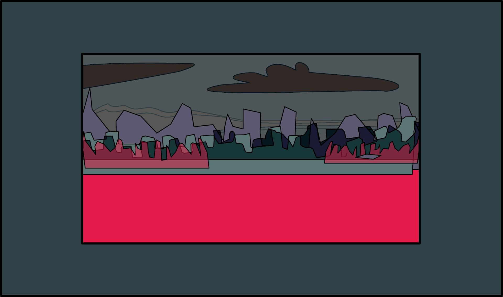
So I’ve come to a bit of a compromise here. The idea is that I have only about half a dozen layers corresponding to different ‘depths’ of the drawing. I then put those elements into their respective layers. The advantage of doing this is that I can hide an entire layer with only one mouse click. So I have a a layer for the word mäkätääkkä, a layer for the “chip missiles”, a layer for the buildings, a layer for the antannae, a layer for the background, a layer for the trees. I’ll probably have to separate the layer of buildings into two separate layers, the buildings in front of the big M and the buldings behind the plane of the M. That way I can put the M on it’s own layer too.
Yes I think it is worth naming the layers, otherwise you lose time by trying to figure out which layer is which.
So it’s a little bit like working on 6 different documents at once, except that they all overlay one another. I could just as easily work in a completely new document. And sometimes I actually prefer to do that. For example, with the staellite dishes + antennae, I drew all of them completely separately to the main drawing in a fresh new blank document, and then placed them in their own layer at a later stage. But the main advantage of using layers as opposed to separate documents is because the all line up like transparencies over the top of one another.
² If everyone did that, I believe there wouldn’t be such a vast gap in wealth and income distribution.